Customization
How to change the logo
You can change your logo from the HeaderPro ui component:
import { Logo } from '../icons'

export const HeaderPro = ({ headerData, useMode }: HeaderProps) => {
  return (
      <header className="py-5">
         <div className="container mx-auto px-5 sm:px-0">
            <div className="navbar grid grid-cols-12">
               <div className="col-span-3">
                  <Link href={`/`}>
                     <Logo className={`text-base-content`} />
                  </Link>
               </div>
               ...
  );
}
Here Logo icon is used and imported from the icon component, which takes className props to change the logo color with the theme color changes. Here two examples of logo with light and dark theme:
-
Logo at
Light theme: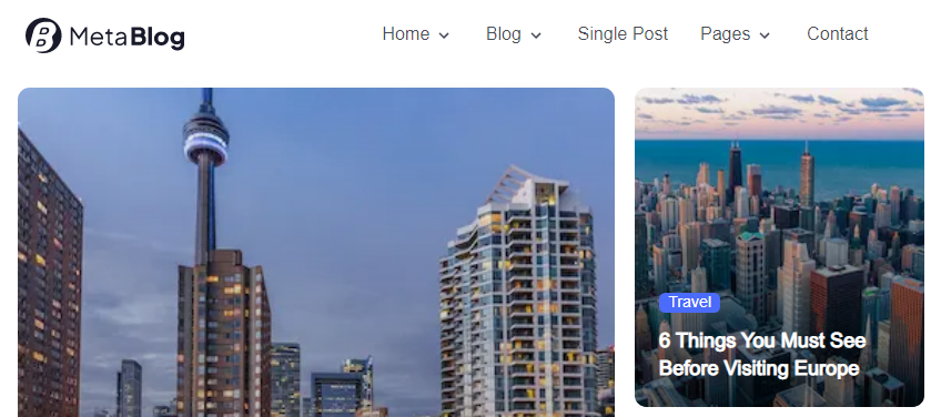
-
Logo at
Dark theme: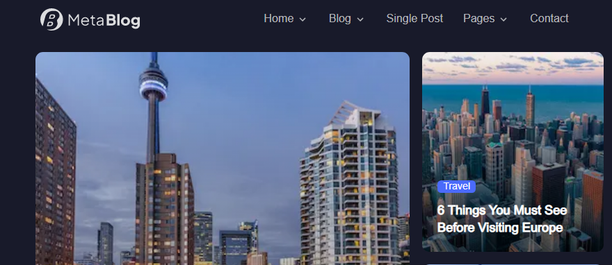
How to change the Menu
You can change your menu items from the headerData inside site data folder:
export const headerData = [
{
name: "Home",
link: "/",
},
{
name: "Blog",
link: "/blog",
subMenu: [
{
name: "Grid Style",
link: "/blog",
subMenu: [
{
name: "Right Sidebar",
link: "/category/right-sidebar",
},
{
name: "Left Sidebar",
link: "/category/left-sidebar",
},
],
},
{
name: "List Style",
link: "/category/list-no-sidebar",
subMenu: [
{
name: "Right Sidebar",
link: "/category/list-right-sidebar",
},
{
name: "Left Sidebar",
link: "/category/list-left-sidebar",
},
],
},
],
},
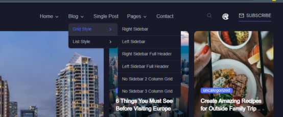
];Here subMenu items can be added throw child submenu array at the headerData array. Example submenu preview for blog submenu:
How to change the content
You can add or customize your content throw importing ui component and sending the data props into the ui component. You can directly customize the design and data props from the ui component too: The ui components can be changes throw two ways:
moleculeslevel changing:
You can change your data schema or component level changing directly from here.
type PostOverlayLgProps = {
   cardData?: {
      id: number
      title: string
      slug: string
      featuredmedia: { sourceUrl: string; alt: string }
      author: string
      authorId: number
      category: any
      publishTime: string
      avatar: string
      content: string
   }
}

export const PostOverlayLg = ({ cardData }: PostOverlayLgProps) => {
   return (
      <div className="card relative w-fit h-fit font-work">
         {/* Card Image */}
         <div className="min-h-[370px] sm:min-h-[660px]">
            <figure className="h-full max-w-full">
              ...
            </figure>
         </div>
            <div className="mt-4">
               <Link href={`/single-post`}>
                  <h2 className="text-lg sm:text-xl line-clam-3 md:text-3xl lg:text-4xl font-semibold text-neutral-content hover:text-primary transition hover:duration-300 line-clamp-3">
                     {cardData?.title ||
                        'The Impact of Technology on the Workplace: How Technology is Changing'}
                  </h2>
               </Link>
            </div>
               ...
  );
}
Here at PostOverlayLg you can check the required data schema and the card code design. You can customize these schema and design in this card.
organism(a group of molecules) level changing:
You can change a section or component group from here.
export const PostOverlayMixBanner = ({ data }: PostOverlayMixBannerProps) => {
  return (
    <>
      <div className="container mx-auto flex flex-col md:flex-row gap-5	px-5 sm:px-0">
        <div className="w-full md:w-6/12">
          {data?.slice(0, 1).map((item: any, index: number) => (
            <PostOverlayLg cardData={item} key={index} />
          ))}
        </div>
        <div className="w-full md:w-6/12 flex flex-col gap-5">
          {data?.slice(1, 2).map((item: any, index: number) => (
            <PostOverlayLandscapeSm cardData={item} key={index} />
          ))}
          <div className="w-full flex flex-col sm:flex-row gap-5">
            {data?.slice(2, 4).map((item: any, index: number) => (
              <PostOverlaySm cardData={item} key={index} />
            ))}
          </div>
        </div>
      </div>
    </>
  );
};
Here at PostOverlayMixBanner you can check the structure of a section. You can customize these section layout from here.
How to change the Color, Theme, Font, etc.
- Change the
Color,Theme:
You can change your theme color from the tailwind.config.js.
 daisyui: {
      ...
      themes: [
         {
            dark: {
               ...require('daisyui/src/colors/themes')['[data-theme=dark]'],
               primary: '#4B6BFB',
               'primary-content': '#FFFFFF',
               'primary-focus': '#405BD5',
               secondary: '#696A75',
               'secondary-focus': '#3B3C4A',
               'secondary-content': '#FFFFFF',
               accent: '#3CC288',
               'accent-focus': '#33A574',
               'accent-content': '#FFFFFF',
               neutral: '#181A2A',
               'neutral-focus': '#141624',
               'neutral-content': '#FFFFFF',
               'base-100': '#181A2A',
               'base-200': '#141624',
               'base-300': '#E8E8EA',
               'base-content': '#DCDDDF',
               info: '#FFFFFF',
               success: '#009485',
               warning: '#ff9900',
               error: '#ff5724',
            },
         },
         ...
Here at the config file, the example of dark theme colors are given. You can customize the colors from here to have an effect on different theme mode.